Candulor AG
Rebranding for swiss high-end dental prosthetics manufacturer
Candulor is a Swiss manufacturer specializing in high-end dental prosthetics and materials for removable dentures. With over 90 years of expertise, the company combines traditional craftsmanship with advanced technologies such as digital workflows, 3D printing, and precision manufacturing to develop premium prosthetic solutions for dental professionals worldwide.
Responsibilities
Concept Development, Art Direction and Visual Identity based on strategic positioning developed in collaboration with the agency’s strategy team.
-
Challenge
Candulor is a globally operating Swiss heritage company with more than 90 years of experience in high-end dental prosthetics. The field of dental prosthetics naturally demands quality, precision, and trust — qualities that often result in conservative brand appearances. The goal of the brand refresh was multi-layered: while the industry and internal processes were becoming increasingly digitalized and technologically advanced, the brand image no longer reflected that progress. Prosthetics are now created through 3D printing, robotic milling, and laser-based precision measurements. Candulor wanted a brand identity that felt as individual and forward-thinking as its products while clearly differentiating itself from competitors and reinforcing its position as a market leader and innovation driver.
Solution
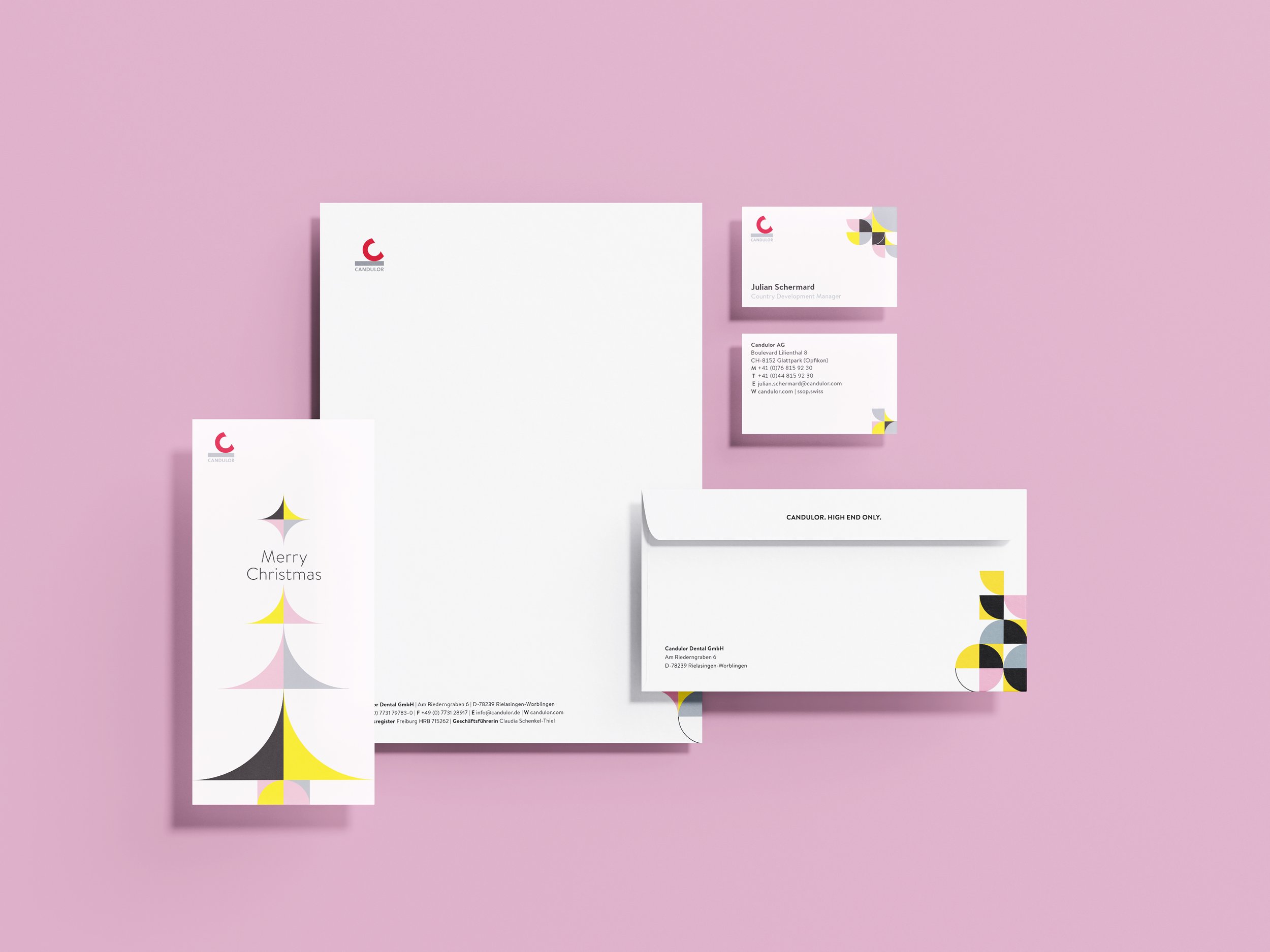
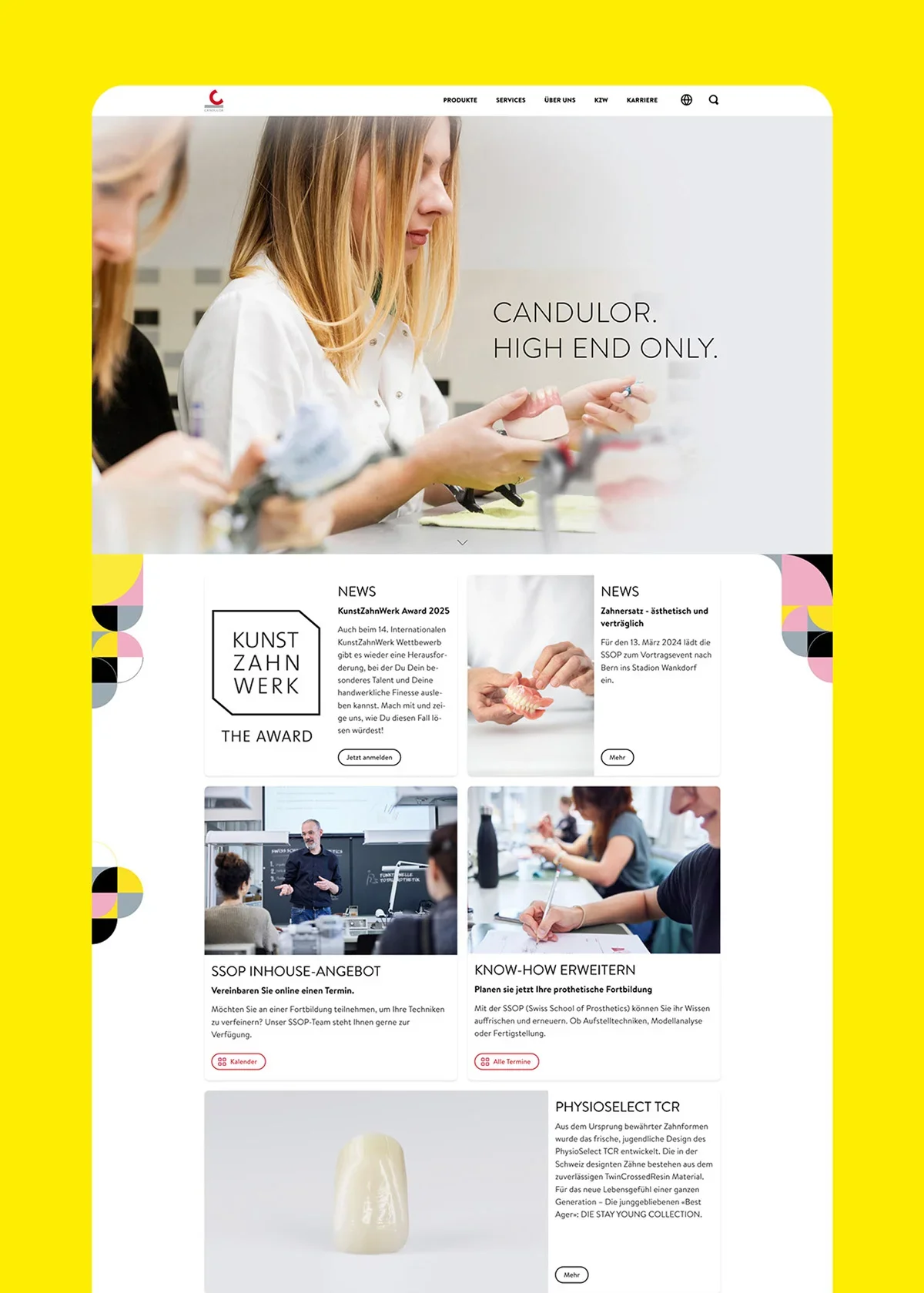
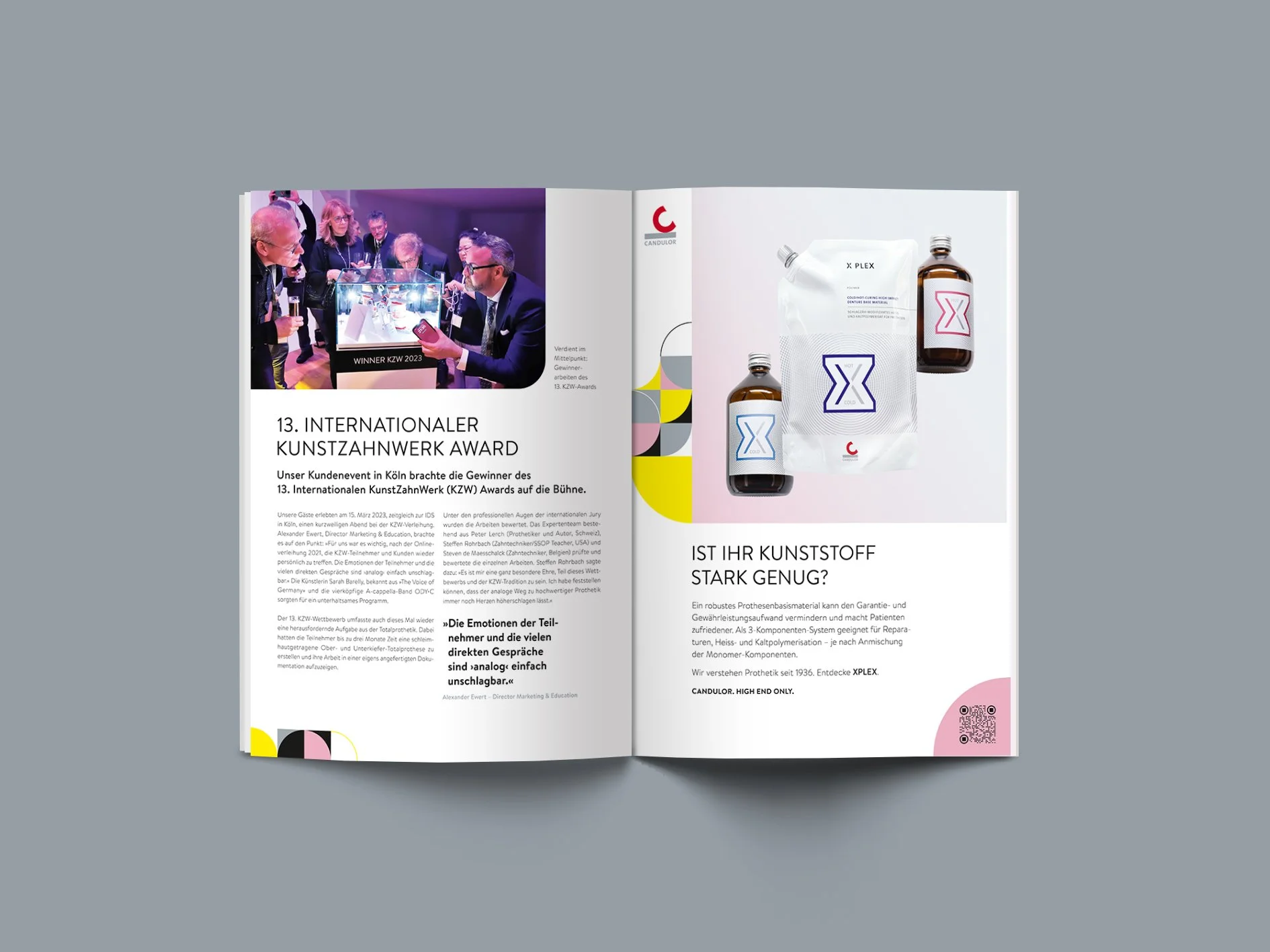
The concepts of individuality and momentum were captured through a visual system built around “Tiles” — quarter-circle elements that expand into patterns and structures across digital and physical media. The system introduced a more expressive and vibrant color palette, expanding the traditional red and gray with pink, yellow, and black to create more contrast, energy, and visual distinction. Product photography was reimagined through bold compositions that elevated even the most technical products into visually engaging objects. A new typeface further modernized the brand and reinforced Candulor’s more human-centered identity. The refreshed visual language was unified under the new company claim: “Candulor. High End Only.”
Impact
The new brand identity allowed Candulor to break away from the “outdated” perception often associated with the industry while further strengthening its position as a premium market leader. The more progressive visual direction was especially well received by younger employees and customers — proving that “prosthetics can be cool.” Increased traffic across the website and social media channels further reflected the shift in brand perception and relevance.
Learnings
When reinventing a company with a long-standing history, finding the right balance between evolution and revolution becomes essential. How much visual heritage should remain? How much change will long-term customers accept? The stronger a company is anchored in trust and quality, the more confidently it can evolve. When an established name embraces a bold new appearance, it signals progress, ambition, and the willingness to move forward.